Summary
This phase involved pulling all the information from my database and deciding to display it on a graph to track the number of peope fed each week in realtime
Related Sections/Pre-Reading
Content
Why a Graph?
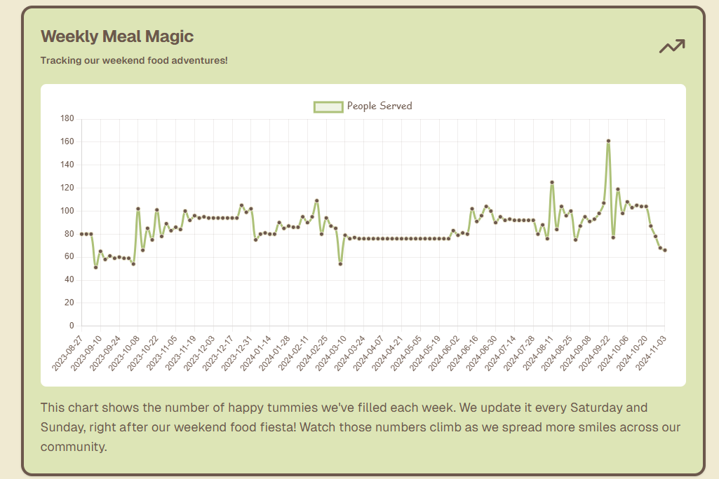
One of the main goals of the website is to show volunteers the real impact they’re making. By displaying the number of people fed each week on a graph, they can easily see trends over time. This quick visual helps the team look at how demand is changing and can even help plan for the next week’s supplies, making sure we’re ready for any increases.
Fetching Data with Prisma
To build this chart, I needed all the data entries from the database. That’s where Prisma came in again, making it super easy to “fetch” or grab all the records. Instead of writing a complex query, I could use a simple command in Prisma to pull every weekend’s feeding data. This kept everything organized and quick, allowing me to focus on how the data would be presented.
Plotting the Data on a Line Chart
With the data in hand, I used a line chart module to create the visual. Line charts are perfect for showing trends over time, so this was an ideal choice. I set up the chart so that the x-axis (the timeline) only showed weekends, since those are the only days when we provide food. By filtering out weekdays, the graph remains clean and focused on the days that matter for ObsCanFeedYou.